Understanding how R creates images with base graphics and ggplot2, practice using ggplot2 to customize figures, and practice creating reusable tools for plotting
Author
Michael C Sachs
Learning objectives
In this lesson you will
Understand how R creates images with base graphics and ggplot2
Practice using ggplot2 to customize figures
Practice creating reusable tools for plotting
Create your own theme
Load the ggplot2 package and customize your own theme. Look at the built-in themes and the ggthemes package for inspiration.
Tips
You can save your customization using the theme(), but that will only modify the current theme
library(ggplot2)library(palmerpenguins)
Attaching package: 'palmerpenguins'
The following objects are masked from 'package:datasets':

    penguins, penguins_raw
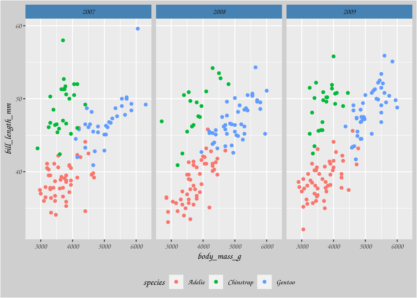
mytheme <-theme(strip.background =element_rect(fill ="steelblue"), text =element_text(family ="Comic Sans MS"), plot.background =element_rect(fill ="grey81"), legend.background =element_rect(fill =NA), legend.position ="bottom" ) ggplot(penguins, aes(x = body_mass_g, y = bill_length_mm, color = species)) +geom_point() +facet_wrap(~ year) + mytheme
Warning: Removed 2 rows containing missing values or values outside the scale range
(`geom_point()`).
theme_set(theme_bw())ggplot(penguins, aes(x = body_mass_g, y = bill_length_mm, color = species)) +geom_point() +facet_wrap(~ year) + mytheme
Warning: Removed 2 rows containing missing values or values outside the scale range
(`geom_point()`).
To make a fully custom theme, start with an existing one, and modify it
my_fulltheme <-theme_grey() + mythemeggplot(penguins, aes(x = body_mass_g, y = bill_length_mm, color = species)) +geom_point() +facet_wrap(~ year) + my_fulltheme
Warning: Removed 2 rows containing missing values or values outside the scale range
(`geom_point()`).
Save your favorite color scales as a function for easy reuse. Use discrete_scale or continuous_scale.
my_qual_scale <-function(...) {discrete_scale("color", scale_name ="OI", palette =function(x) { res <-palette.colors(x, "Okabe-Ito")[1:x]names(res) <-NULL res }, ...)}ggplot(penguins, aes(x = body_mass_g, y = bill_length_mm, color = species)) +geom_point() +facet_wrap(~ year) + my_fulltheme +my_qual_scale()
Warning: The `scale_name` argument of `discrete_scale()` is deprecated as of ggplot2
3.5.0.
Warning: Removed 2 rows containing missing values or values outside the scale range
(`geom_point()`).
Adding elements to a plot
Starting with this example from the lecture:
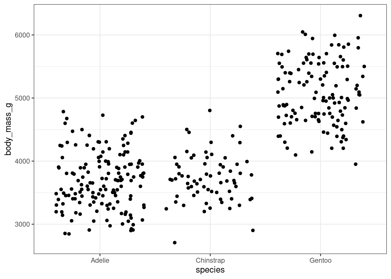
plotbm <-ggplot(penguins, aes(x = species, y = body_mass_g)) +geom_jitter()plotbm
Warning: Removed 2 rows containing missing values or values outside the scale range
(`geom_point()`).
Add solid horizontal lines at the mean of each species.
Add dotted horizontal lines at the median of each species.
(For keeners) Create a reusable component that adds the mean and median lines to a jitter plot. Try it out on a different plot, e.g., sex versus bill length
Make a better plot than before
Use a figure from a recent analysis or publication that you would like to reproduce or enhance. Use tidy data principles to set yourself up for success.
If you cannot think of anything, here is an example.
The following code uses the survival package to estimate survival curves in two treatment groups.
library(survival)sfit <-survfit(Surv(time, status) ~ x, data = aml)sfit
Call: survfit(formula = Surv(time, status) ~ x, data = aml)

                 n events median 0.95LCL 0.95UCL
x=Maintained    11      7     31      18      NA
x=Nonmaintained 12     11     23       8      NA
str(sfit)
List of 18
 $ n        : int [1:2] 11 12
 $ time     : num [1:20] 9 13 18 23 28 31 34 45 48 161 ...
 $ n.risk   : num [1:20] 11 10 8 7 6 5 4 3 2 1 ...
 $ n.event  : num [1:20] 1 1 1 1 0 1 1 0 1 0 ...
 $ n.censor : num [1:20] 0 1 0 0 1 0 0 1 0 1 ...
 $ surv     : num [1:20] 0.909 0.818 0.716 0.614 0.614 ...
 $ std.err  : num [1:20] 0.0953 0.1421 0.1951 0.2487 0.2487 ...
 $ cumhaz   : num [1:20] 0.0909 0.1909 0.3159 0.4588 0.4588 ...
 $ std.chaz : num [1:20] 0.0909 0.1351 0.1841 0.233 0.233 ...
 $ strata   : Named int [1:2] 10 10
  ..- attr(*, "names")= chr [1:2] "x=Maintained" "x=Nonmaintained"
 $ type     : chr "right"
 $ logse    : logi TRUE
 $ conf.int : num 0.95
 $ conf.type: chr "log"
 $ lower    : num [1:20] 0.754 0.619 0.488 0.377 0.377 ...
 $ upper    : num [1:20] 1 1 1 0.999 0.999 ...
 $ t0       : num 0
 $ call     : language survfit(formula = Surv(time, status) ~ x, data = aml)
 - attr(*, "class")= chr "survfit"
How would you plot the Kaplan-Meier curves in the two treatment groups using ggplot2? What about adding confidence intervals to the plot? What about adding tick marks where the censoring times are?
Complex figures with base graphics
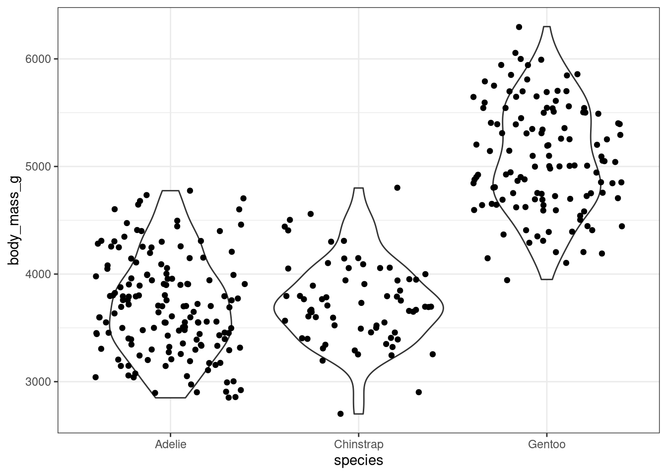
Check out this violin plot
ggplot(penguins, aes(x = species, y = body_mass_g)) +geom_violin() +geom_jitter()
Warning: Removed 2 rows containing non-finite outside the scale range
(`stat_ydensity()`).
Warning: Removed 2 rows containing missing values or values outside the scale range
(`geom_point()`).
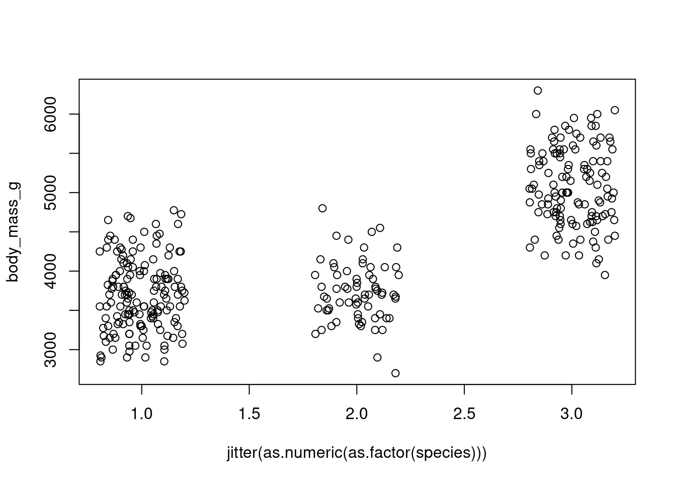
How would you produce a similar plot using base graphics? After doing so, reflect, do you appreciate to convenience and flexibility of ggplot2?
Hints
Use the density function to calculate the densities by species. The results are stored in a list with elements x and y. Then transform by rotating 90 degrees and mirroring. Plot the result using the polygon function.